


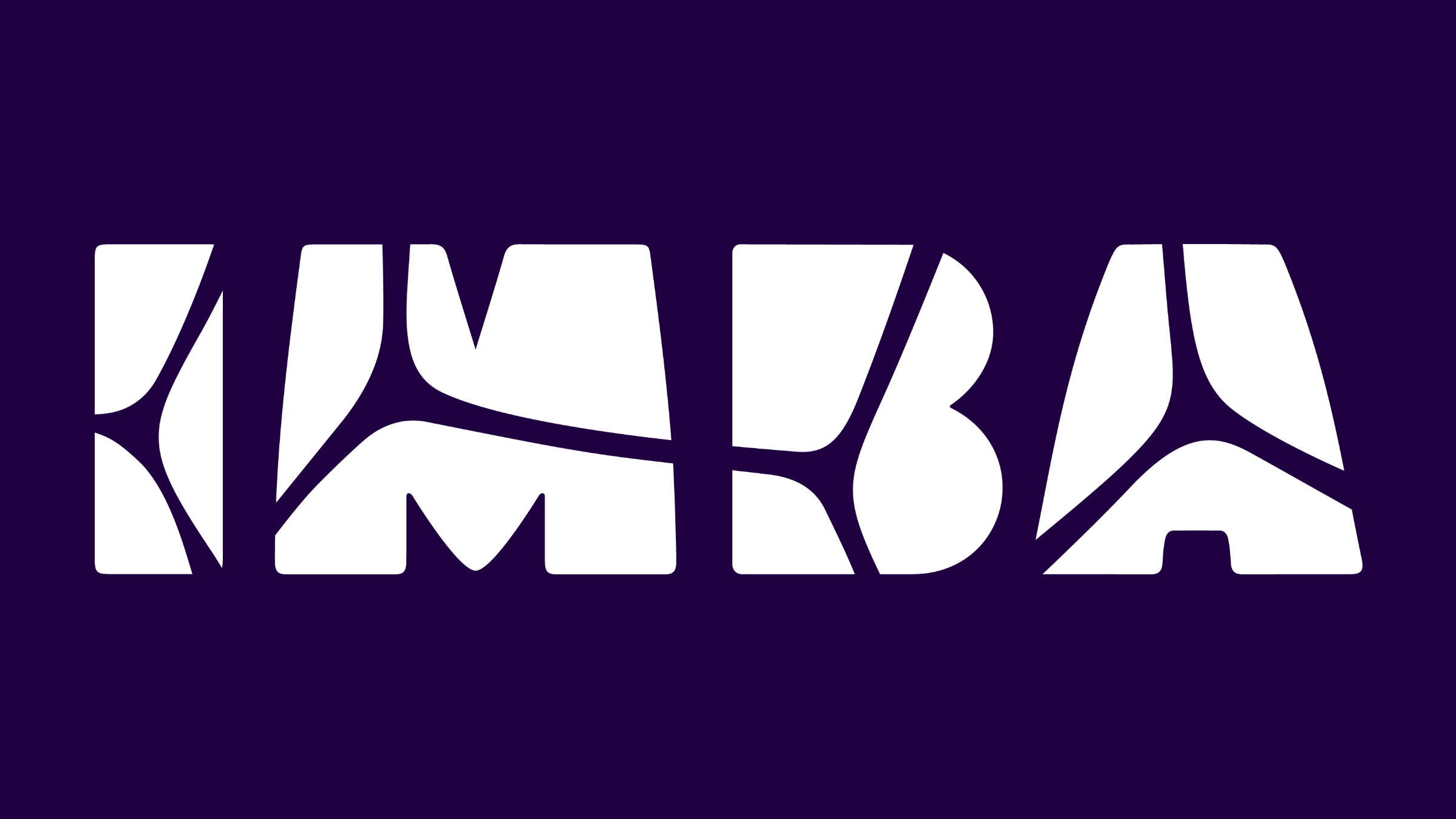
IMBA has introduced a new logo, whose letters are divided by the branching pattern of a cell membrane. Developed through a collaborative process with IMBA's community, the redesign reflects both the institute's research and the way it sees itself today.
The first IMBA logo was created by a staff member as a submission to an open competition in the early 2000s, when IMBA was emerging as a new life sciences research institute. Since then, IMBA has grown to a community of more than 260 people and 13 research groups, and its scientists have published approximately 1,200 peer-reviewed publications - in short, IMBA has matured from an ambitious vision to one of Europe’s leading life science research institutions. The composition of IMBA’s leadership had recently shifted as well. "Having two women as directors is certainly a visible part of the cultural change affecting the institute," says IMBA Business Director Barbara Kraus. "In 2025, the IMBA community started to develop a new logo that would fit better with what the institute and the people that form it entail."
The new logo set out from stakeholder consultations in which members of the IMBA community expressed the need for a more contemporary look that would endorse both science and diverse people behind it. The resulting design is built around the cell: the IMBA wordmark is divided by an organic network of branching lines, like cell membranes or biological tissue seen under a microscope. The logo uses a purple and green palette, inspired by commonly used channel colors of fluorescence microscopy. Secondary colors, chosen through a community vote, expand the palette, allowing the logo to work across all the places the institute needs it to show up: on the website, in presentations, on event materials, in internal and external communications, and alongside other institutional logos without looking out of place.
IMBA's community shaped the project from the inside: staff members answered questions about the institute's purpose and identity long before first design concepts were drawn up. Respondents most strongly associated IMBA with curiosity and discovery, while also highlighting the institute's people, facilities, and research excellence. The agency The Gentlemen Creatives, which accompanied the process, analyzed surveys and focus group findings to understand how the institute was perceived to then develop a visual identity that could work across IMBA's communications. IMBA’s senior scientists eventually agreed on the final design unanimously.
"When we asked the community what best describes the purpose of IMBA, two answers emerged: to increase knowledge and to push boundaries,” says IMBA Scientific Director Elly Tanaka. “The new logo reflects these values by putting the science inside the name. One that could only belong to a molecular biology institute."
The new logo provides a durable visual identity that can carry the institute into its next phase of growth. As with the original logo, IMBA's pioneering spirit and curiosity will be part of that journey. “Curiosity”, Tanaka and Kraus agree, “is what keeps IMBA moving forward.”
The logo files and supporting materials are available at imba.ac.at/downloads.
Source: Web of Science and InCites (Clarivate), accessed 24 July 2026.